Why a Great Banner ChangesEverything
In a world saturated with visual content trade shows, stores, or events standing out isn’t optional: it’s essential. A well-designed banner doesn’t just share a message; it creates an instant visual experience that grabs attention. That’s why investing in high-quality, strategically designed banners can significantly enhance your brand’s visibility and engagement.
Whether you’re promoting a product, guiding attendees at an event, or reinforcing your store’s visual identity, a great banner can be the difference-maker. At Sign Depot ATX, we provide tailored solutions that go beyond aesthetics we create visual statements with purpose, strategy, and style.
Set Clear and Measurable Goals
Before diving into design, ask yourself: what is the banner meant to achieve? An effective banner isn’t just visually appealing it’s aligned with a clear objective. Whether the goal is to boost sales, promote an event, generate leads, or reinforce brand awareness, each intention demands a tailored design approach.
For instance, an event banner should emphasize the date, location, and a strong call to action, while a product banner might highlight key benefits or discounts. Defining your goal helps guide decisions around color schemes, typography, visual hierarchy, and content placement.
Grab Attention at First Glance
Eye-Catching Colors
Color is the first visual language we notice. To truly make your banner stand out, the color palette should contrast with its environment while staying true to your brand identity. For instance, in a natural outdoor setting, bright tones like orange or magenta will stand out more than greens or browns that blend into the background.
Color psychology also plays a vital role: red creates urgency or highlights a promotion, blue builds trust and professionalism, green evokes calm or sustainability, and yellow quickly attracts attention and conveys energy. Choosing purposeful colors strengthens your message and encourages action.
Use Bold, Readable Typography
Typography must be powerful, clear, and legible from a distance. Bold sans-serif fonts like Arial Black or Helvetica Bold work best, especially when paired with generous letter spacing. Follow the 10:100 rule: 1 inch of letter height for every 10 feet of viewing distance. This ensures readability at a glance.
Simplicity: Less Is More
Overloading a banner with information is a common mistake. Instead, focus on a single idea or product, and communicate it with just a few impactful words. White space not only improves aesthetics but also draws attention to the core message.
In a time crunch, you can go for same day banner printing in Austin to meet last-minute event deadlines without sacrificing design quality or clarity.
Focus on a Single Main Element
An effective banner starts with a well-defined visual hierarchy. Begin by choosing one main focal point a striking image or a short, impactful phrase that draws attention immediately. This primary element should be placed at the top or center of the banner, depending on the layout, to ensure it’s the first thing viewers notice.
Supporting elements like logos, subtext, or icons should be arranged to reinforce the main message and guide the reader’s eye from top to bottom. A clear hierarchy not only enhances the design but also improves the banner’s ability to communicate quickly and effectively.
Make Your Call to Action Shine
The call to action (CTA) is the heart of your banner’s purpose. Whether it’s a “Buy Now” button or a phrase like “Book Your Spot,” it needs to stand out through contrast, larger size, or strategic placement. Your CTA should be easily visible and prompt immediate engagement.
To make your message visible from all directions, consider using double sided banners, perfect for events or retail settings with high foot traffic in multiple directions.
Ensure Readability in Any Environment
Distance-Proof and Noise-Resistant Design
No matter how striking your banner design is, if it can’t be read easily in its intended setting, it fails its purpose. That’s why it’s important to test visibility at various distances, ensuring that key messages are legible from 10, 20, or even 30 feet away. If your audience has to squint or pause to interpret your banner, they’re likely to move on.
Maintain high contrast between text and background. Avoid cluttered backdrops, complex gradients, or intricate details that disappear from a distance. Bold fonts, solid colors, and strategic white space make your message stand out even in busy or noisy environments.
Optimize Your Design for Multiple Formats
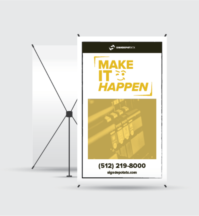
Your banner should be flexible enough to scale across different formats without losing clarity. Whether it’s a roll-up banner for a trade booth, a wide horizontal banner for a storefront, or a large backdrop for photos, the layout should stay clean, organized, and impactful.
For example, a clean design works great for both trade shows and school events like a banner high school, where messages need to be clear and accessible for students, parents, and guests alike.
Indoor vs. Outdoor: Each Material Has Its Purpose
Selecting the right material is just as crucial as your banner’s design. Different settings require different properties, and using the right material ensures durability, print quality, and a professional appearance.
- Vinyl: Best for outdoor use, it resists water and sunlight—perfect for storefronts, outdoor events, or festivals.
- Fabric: Ideal for indoor use with a polished, glare-free look. Great for trade shows, conferences, or photo backdrops.
- Mesh: Designed for windy outdoor locations, it allows air to pass through, reducing stress on mounting points.
- Rigid PVC: Suited for fixed signage or when a strong, stable structure is needed.
Durability and Reinforcements
For banners used outdoors or in multiple events, durability is key. Reinforced corners, metal grommets for easy mounting, and UV-resistant inks that prevent fading are highly recommended. These features ensure your banner maintains its visual impact and structural integrity over time.
Pro Tips to Maximize Your Impact
Budget-Friendly Designs That Still Look Great
You don’t need a massive budget to create a visually compelling banner. Smart design choices like limiting the color palette, using high-resolution black-and-white images, or reusing adaptable layouts can help you create impressive results without overspending.
Economy banner
options are excellent for short-term promotional campaigns, temporary advertisements, or single-use events. With thoughtful design, these budget-friendly solutions can still make a big impression.
Benefits of Mesh Material for Outdoor Use
For outdoor events or windy areas, traditional banners may struggle to stay in place. That’s where mesh banners come in. Their perforated design allows wind to pass through, reducing stress on mounting points and increasing longevity.
You can find mesh banner online options ready to print and ship perfect for construction fences, festivals, or sports venues.
The Power of Visual Repetition at Events
For brand visibility, visual repetition is a powerful tool. Step and repeat banners for brand visibility are ideal for photo backdrops, press events, or conferences. Repeating logos across a clean background ensures every photo captures and reinforces your brand’s identity.
Your Banner Should Work for You
At Sign Depot ATX, we believe a banner isn’t just a printed sheet it’s a strategic communication tool. When thoughtfully designed, it can grab attention, convey a message clearly, and drive real results, from attracting new customers to strengthening your brand identity.
Applying techniques like visual hierarchy, simplicity, smart color use, and material selection can turn an ordinary banner into a high-impact asset. We see it every day in projects of all sizes: a well-crafted design makes all the difference.
Contact Information
- Address: 12110 Manchaca Rd. Suite 200, Austin, TX, 78748
- Email: wecare@signdepotatx.com
- Phone: 512 219 8000
- Follow us:
 Facebook
 Instagram
If you want your banner to not only look great but truly perform, we invite you to consult with our team of printing and design experts. We’re here to help turn your vision into a powerful and effective sales tool let’s make it happen together.
Why Choose
Custom Murals
How to Choose the
Right Artist in Austin, Texas
Types of Custom
Murals Available
The Creative Process
Behind a Custom Mural
Inspiration for
Your Next Project
COMPLETE THE FORM
CHECK OUR WORK
FAQ’S
What makes a banner design truly stand out?
A standout banner grabs attention instantly through bold colors, readable typography, and a clear focal point. It combines aesthetic appeal with strategic messaging, guiding viewers’ eyes and prompting them to act—whether it’s visiting a site, attending an event, or making a purchase.
How do I choose the right colors for my banner?
Choose colors that contrast with the environment and match your brand identity. For outdoor visibility, bright tones work best, while color psychology can influence action—red for urgency, blue for trust, yellow for energy. Always prioritize contrast for readability.
What size and font should I use to ensure readability?
Follow the 10:100 rule: 1 inch of letter height for every 10 feet of viewing distance. Use bold, sans-serif fonts like Helvetica or Arial Black, and avoid intricate or small typefaces. Clear, large text ensures your message is seen and understood quickly.
Which materials are best for different banner uses?
- Vinyl: Best for durable outdoor use.
- Fabric: Great for indoor events and glare-free photos.
- Mesh: Ideal for windy areas outdoors.
Rigid PVC: Perfect for fixed signage requiring structure.
Choosing the right material ensures durability and clarity in any environment.
What are common banner design mistakes to avoid?
Avoid cluttered layouts, poor color contrast, small or fancy fonts, low-resolution images, and missing contact info. Focus on simplicity, visual hierarchy, and a strong call to action to ensure your banner is clear, professional, and effective.
Find Us in Austin, Texas
12110 Manchaca Rd. Suite 200 Austin, TX, 78748
Email: wecare@signdepotatx.com
Phone: 512 219 8000


